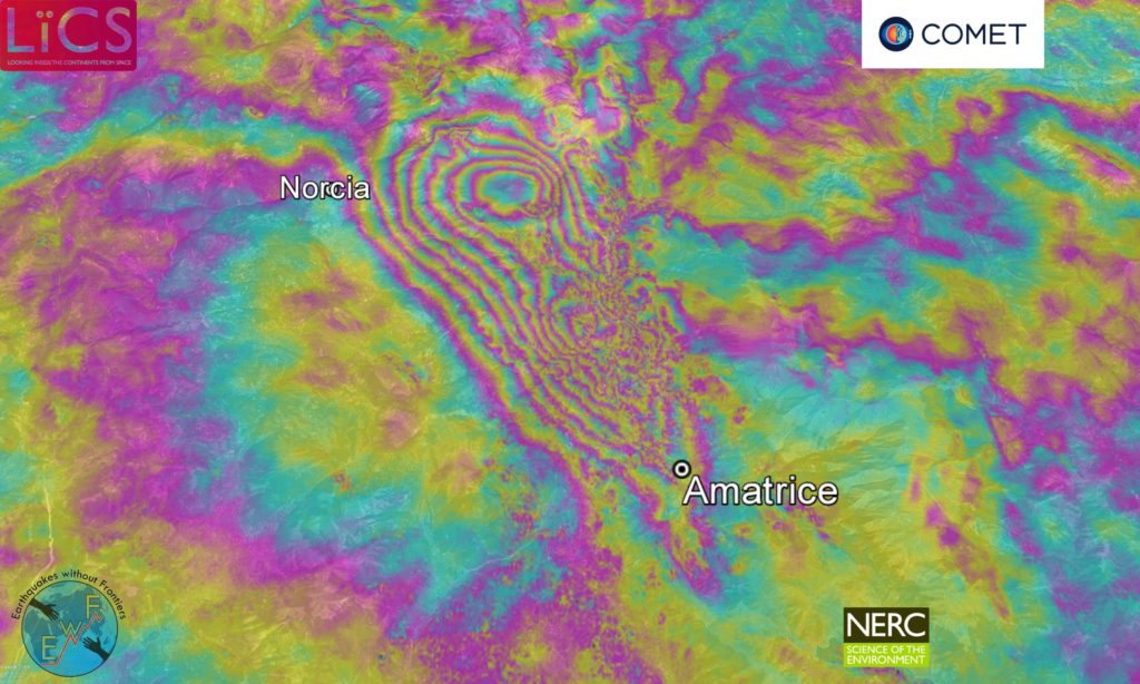
We use InSAR to make surface deformation maps, or interferograms, like this one from the 2016 Apennines earthquakes in Italy.
Radar interferometry
Most remote sensing satellites measure the sun’s radiation reflected back from the ground, usually in the visible and infra-red part of the electromagnetic spectrum.
Radar satellites are different. They transmit electromagnetic waves to illuminate an area of the Earth’s surface, and record the amplitude and phase of the waves that bounce back.
By looking at SAR images of the same area before and after an earthquake, we can compare the two sets of data, i.e. the phase change for each radar wave, to create an interferogram.
[read more=”Read more” less=”Read less”]
The phase of a wave describes its position – whether it is at a peak, a trough, or somewhere in between. The phase is measured like an angle from 0 to 360 degrees (or 0 to 2π radians).
Each wave covers an area approximately 100 km wide and is used to create a Synthetic Aperture Radar or SAR image. “Synthetic” refers to how the satellite moves in a way that lets it imitate a much larger radar transmitter, covering a larger area.
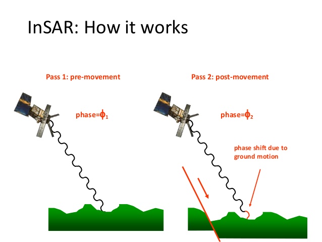
Suppose a satellite sends and receives a single radar wave to exactly the same point on the ground before and after an earthquake.
If the phase readings for the same point are:
- π radians before the earthquake
- 2π radians after the earthquake
The phase difference between the two is π radians, because the phase difference at the ground is doubled in the wave that bounces back to the satellite.
[/read]
Interferograms
The different colours in an interferogram show changes in the phase of radar waves before and after an earthquake. The coloured contours represent the interference fringes between the two sets of data.
This interferogram shows the area around the Napa Valley, which was struck by an earthquake in 2014.
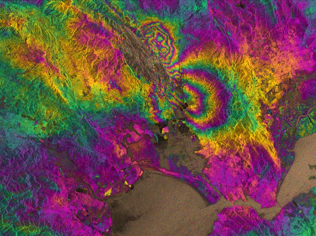
The distance between each interference fringe represents ground movement (on an interferogram, the phase difference of π described above is shown by a green pixel).
The closer together the fringes are, the greater the strain experienced by the ground during the earthquake. The red lines show where the fringes are closest, and also the location of the fault that caused the earthquake.
This process is repeated for every point on the ground with two SAR images of the same area.
In reality, creating an interferogram is a little more complex. A satellite is unlikely to ever be in exactly the same position twice, and you also have to compensate for topography, atmosphere and noise.
How we interpret interferograms
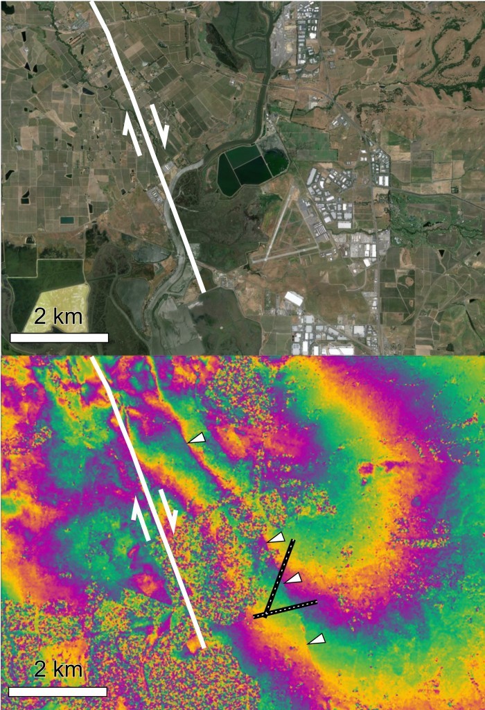
In this interferogram of the 2014 Napa Quake, contours (interference fringes) of the same colour represent one wavelength’s difference between the phases recorded before and after the earthquake.
The closer together the fringes, the greater the strain on the ground. The red lines show where the fringes are closest together and therefore the source of the earthquake.
Determining future seismic hazard
Interferograms help us to determine the location, magnitude and type of an earthquake. They can also help us to improve earthquake models, and investigate the future seismic hazard for an area.
Scientists also use interferograms to measure accumulation of interseismic strain. This technique offers most potential as a medium-range forecasting tool, although it doesn’t provide precise predictions along the lines of ‘there will be a catastrophic earthquake next Wednesday’. Instead, it gives the likelihood of an earthquake occurring within a certain period.